The promise of modern project management software is seductive: a "Single Pane of Glass" where executives can see the status of every initiative in real-time. No more chasing updates, no more surprises. Just pure, data-driven visibility.
In practice, however, these dashboards often function more like a "Green Light Generator." They show that everything is on track—until the moment it isn't.
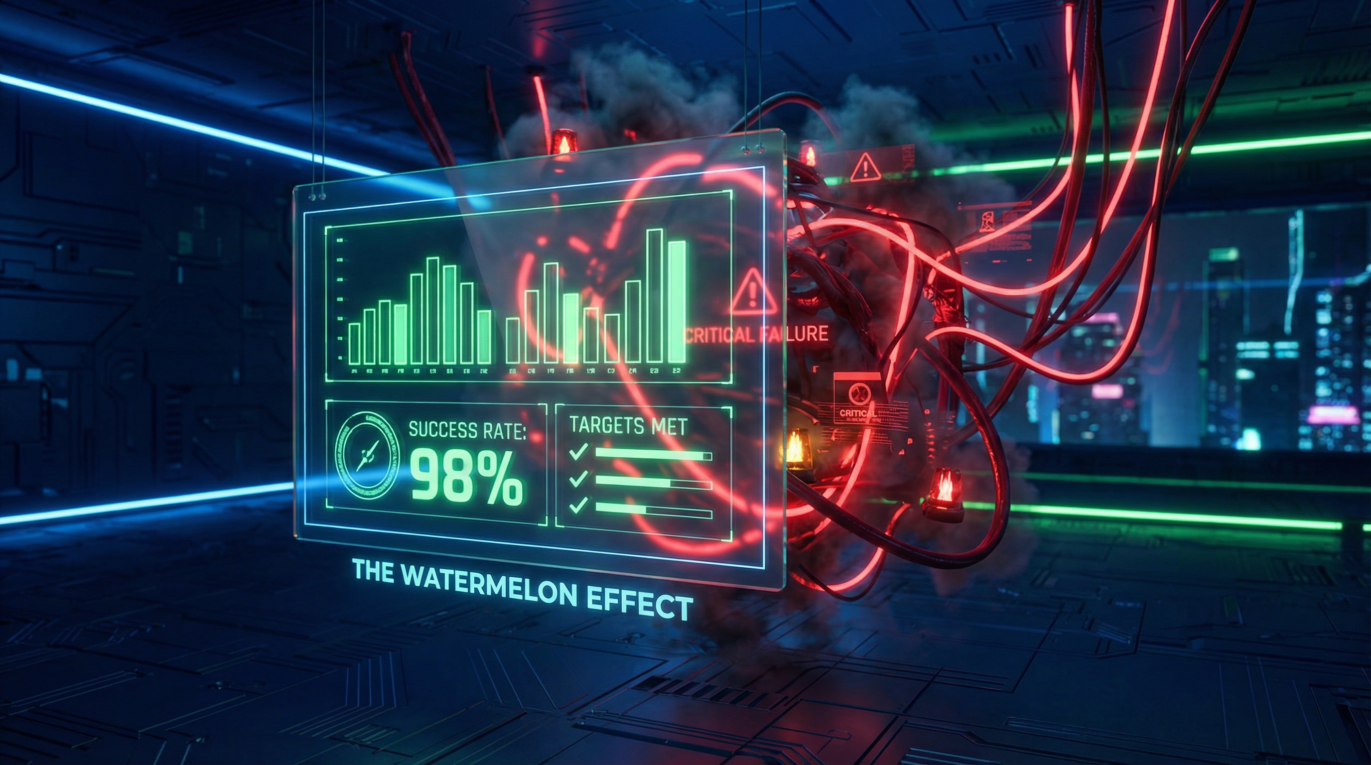
This phenomenon is known as the Watermelon Effect: projects look green on the outside (in the dashboard) but are deep red on the inside (in reality). The root cause isn't the software's visualization engine; it's the Data Hygiene Gap created by user friction.
The Friction-Visibility Trade-off
Dashboards are only as good as the data fed into them. If updating a task takes 10 clicks, a developer will not update it in real-time. They will wait until Friday afternoon, or until a manager demands it.
This creates a "Batch Update" culture. For four days a week, the dashboard shows the status from last Friday. It is technically "digital," but practically "analog." You are looking at a static snapshot masquerading as a live feed.
When executives make decisions based on this stale data, they are steering the ship based on where the iceberg was five days ago.
The "Green" Bias
Beyond latency, there is a psychological bias built into manual reporting. When a user has to manually change a status from "On Track" to "At Risk," they feel a sense of failure. They often delay this update, hoping they can catch up before anyone notices.
Automated systems don't have this ego. A system that automatically flags a project as "At Risk" because no code has been committed in 7 days is far more reliable than a human manually selecting a status dropdown.
True Visibility vs. Vanity Metrics
To break the Dashboard Illusion, organizations need to shift their focus from "Output Metrics" (status reports) to "Input Metrics" (activity signals).
Vanity Signals (The Lie)
- • Manual "% Complete" fields
- • Subjective RAG (Red/Amber/Green) status
- • "Last Updated" > 7 days ago
- • Tasks with no comments/activity
Reality Signals (The Truth)
- • Git commit frequency
- • Ticket cycle time (automated)
- • Comment density on active tasks
- • Login/Usage frequency
When evaluating software, look for tools that reduce the friction of input. Can a user update status via Slack? Does the system infer progress from connected tools (like GitHub or Figma)? The easier it is to input data, the more truthful your dashboard will be.
For a comprehensive look at how pricing models often incentivize bad data hygiene (by limiting who can edit tasks), see our analysis on SaaS Pricing Models.
Key Takeaways for Decision Makers
- 1Friction kills truth. If it takes 5 minutes to update a task, your dashboard will always be 5 days out of date.
- 2Beware the Watermelon. Green dashboards are comforting but dangerous. Look for tools that expose the "Red" inside.
- 3Automate the "bad news." Rely on automated signals (integrations) rather than manual confessions for risk detection.